BOSSGamerDad's Ultimate Excel Guide: "Mastering" Autofill, Conditional Formatting, and Data Structuring for Heat Maps
-
Setting Up the Data in Excel
-
Creating the Excel Heat Map
-
Overcoming Challenges with Excel Autofill and Formatting
-
The Outcome and Excel Data Management Success
I recently set out to create an Excel heat map for my environmental monitoring program in the food manufacturing industry. My goal was to design an Excel visual tool that shows microbiological test results across a fake facility, so that every area immediately stands out if there’s a potential issue. In my setup, each cell on the Excel grid design represents a sampling location. When a test comes back as "Positive," that cell lights up red; if it's "Suspect," it turns yellow. This Excel data visualization quickly pinpoints areas needing extra attention while incorporating Excel conditional formatting for dynamic color changes.
Setting Up the Data in Excel

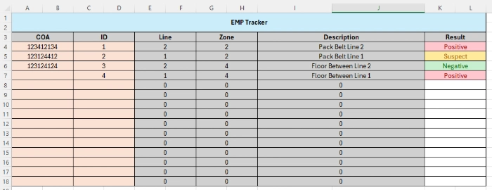
First, I created an Excel Results sheet to serve as the master record, which is a key part of Excel data management. Here’s a quick rundown of the columns I used, which are essential for Excel data structuring and Excel spreadsheet design:

COA (Certificate of Analysis): This column is where I manually enter the ID from the lab’s certificate of analysis. It confirms that each sample has been properly tested and meets quality standards. You can even hyperlink the PDF using Excel image insertion techniques so you can view it on demand.
ID: Every sampling point gets a unique ID. This is crucial because it links a specific location on the heat map to its test result in the Excel master record and supports Excel sheet linking.
Line: This indicates which production or processing line the sample came from. This Excel production line information helps determine if an issue is isolated or affecting multiple areas.
Zone: In a food safety context, “Zone” describes the part of the surface that was tested. For example:
Zone 1: Direct food contact surfaces
Zone 2: Areas close to food contact
Zone 3: Areas a bit further away
Zone 4: Non-food-contact surfaces like walls
These guidelines help with how to structure data in Excel for effective Excel data organization.
Description: A brief note about the location (e.g., “near packaging” or “in break room”) adds extra context about the testing spot, enhancing Excel data linking.
Result: The test outcome is manually entered here—choosing from “Positive,” “Suspect,” or “Negative.” This result drives the Excel dynamic formatting that changes the cell color automatically.
Creating the Excel Heat Map

Next, I set up an Excel Heat Map sheet to visually represent my facility’s layout. Here’s how you can mirror my process using Excel layout tips:
Design the Layout: Create a grid that roughly corresponds to your building’s floor plan. Each cell in the grid represents a specific sampling location—a key part of Excel grid design.
Pro Tip: To make the layout even more realistic, insert a background image of the building. Go to the Page Layout tab, click Background, and select your building image file. Alternatively, use Excel image insertion via Insert > Pictures and send the image to the back so that your grid cells appear on top.Link the IDs: In each cell of the heat map, enter the unique ID that matches the corresponding sampling point from your Excel Results sheet. This linkage allows Excel to “look up” the correct test result using Excel lookup formulas like Excel XLOOKUP.
Setting Up the Dynamic Look with Conditional Formatting:
Although I didn’t include the full Excel conditional formatting tutorial here, the concept is straightforward:I used Excel lookup formulas (such as XLOOKUP) to check the ID in each heat map cell against the Results sheet.
Based on the returned test result, Excel conditional formatting rules automatically change the cell’s background color—red for “Positive” and yellow for “Suspect.” This Excel conditional format from another sheet ensures that whenever a test result is updated in the Results sheet, the corresponding cell on the heat map changes color dynamically. These techniques are often covered in Excel conditional formatting tips and Excel autofill tutorials for similar tasks.
Overcoming Challenges with Excel Autofill and Formatting
Creating this dynamic heat map wasn’t without its hurdles, and I learned plenty about Excel troubleshooting tips along the way:
Absolute vs. Relative References: Initially, I mistakenly used absolute references (like $C$6) in my formulas. This error prevented Excel autofill from working correctly, as the lookup was fixed on one cell when I copied the formula. Switching to relative references (using C6 instead) allowed each cell to adjust automatically—a key insight for anyone wondering how to autofill in Excel.
Non-Contiguous Cells and “Too Many Arguments” Errors: I once tried referencing multiple non-adjacent cells in a single formula and encountered a “too many arguments” error. The solution was to select all the heat map cells together (using Ctrl+click) and apply one conditional formatting rule, letting Excel automatically adjust the rule for each cell. This is an essential part of Excel autofill tips.
Troubleshooting Conditional Formatting: Some cells wouldn’t format as expected until I double-checked the “Applies to” range in the conditional formatting settings and ensured there were no conflicting rules. This is a common challenge discussed in many Excel conditional formatting tutorials.
The Outcome and Excel Data Management Success

After a bit of trial and error, the Excel heat map came together nicely. Every time a test result is updated in the Excel Results sheet, the corresponding cell on the heat map automatically reflects the change—red for “Positive,” yellow for “Suspect,” and uncolored for “Negative.” This dynamic update, achieved through Excel conditional formatting from another sheet, has become an essential part of my environmental monitoring program, helping me quickly spot potential issues and maintain high food safety standards. It’s a prime example of effective Excel data organization and Excel project management.
I hope this detailed walkthrough, packed with Excel data structuring and Excel spreadsheet structuring tips, helps you mirror the sheet on your end. If you’ve built something similar or have any tips and tricks—perhaps another method on how to autofill in Excel or use Excel conditional formatting— I’d love to hear about your experiences in the comments!
-
Setting Up the Data in Excel
-
Creating the Excel Heat Map
-
Overcoming Challenges with Excel Autofill and Formatting
-
The Outcome and Excel Data Management Success